Oftentimes, when desktop support attempts to communicate its performance to other stakeholders in the business, particularly to lay people who do not understand desktop support operations, those people quickly become overwhelmed by the minutia of such measures as technician utilization, and they are confused about how to interpret the results. They are likely to focus in on one, easily-understood metric like customer satisfaction, and draw conclusions about overall desktop support performance from this single metric. This is a classic case of missing the forest for the trees. It is therefore absolutely critical to communicate the overall performance of desktop support, and the balanced scorecard does that for you. Think of the balanced scorecard as your letter grade for the month! In this way, desktop support can track its overall performance, and, in any given month, may see costs go up or customer satisfaction go down or mean time to resolve increase, but these individual measures take on a secondary level of importance because the balanced score provides a more complete and accurate picture of overall desktop support performance.
The Mechanics of Creating a Scorecard
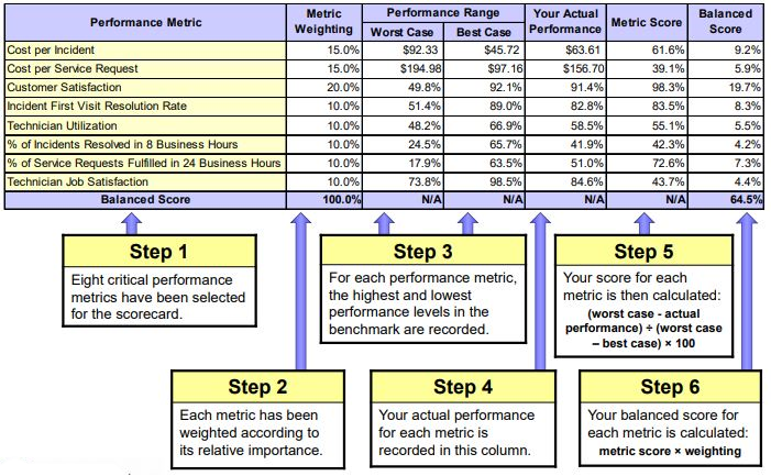
Creating a scorecard is relatively straightforward. You can follow along in Figure 1 below as I explain the process.
Figure 1: Desktop Support Balanced Scorecard
First you select the metrics to include in your scorecard. We suggest including the following eight metrics: Cost per incident, cost per service request, customer satisfaction, incident first visit resolution rate, technician utilization, % of incidents resolved within 8 work hours, % of service requests fulfilled in 24 work hours, and technician job satisfaction. Depending upon the metrics you track in desktop support, you may choose fewer metrics or a different mix of metrics for your scorecard. Secondly, you establish a weighting for each metric based upon its relative importance in the scorecard. This is a judgment call, but we suggest overweighting cost and customer satisfaction, since these are the foundation metrics for service and support. Step 3 is to show a reasonable range of performance – worst case to best case – for each metric. Normally these performance ranges are derived from a benchmark of desktop support. In step 4 your actual performance for each metric is inserted into the third column from the right. A score for each metric is then calculated based on the interpolation formula in step 5. And finally, a balanced score for each metric is determined by multiplying the metric weighting by the metric score. When the metric scores are summed up, you have the total balanced score for desktop support!
In this particular example, the desktop support balanced score is 64.5%. Your balanced score will always range from 0% (if you have the worst possible performance for every metric in the scorecard) to 100% (if you have the best possible performance for every metric in the scorecard). It turns out that the desktop support group in our example has scored quite well. When we run hundreds of desktop support groups through this algorithm, we get a normal distribution centered right at 50%. Those who score above 61% are in the top quartile; those who score between 50% and 61 % are in the second quartile; those between 39% and 50% are in the third quartile; and those below 39% are in the bottom quartile for overall performance.
Benchmarking Your Performance
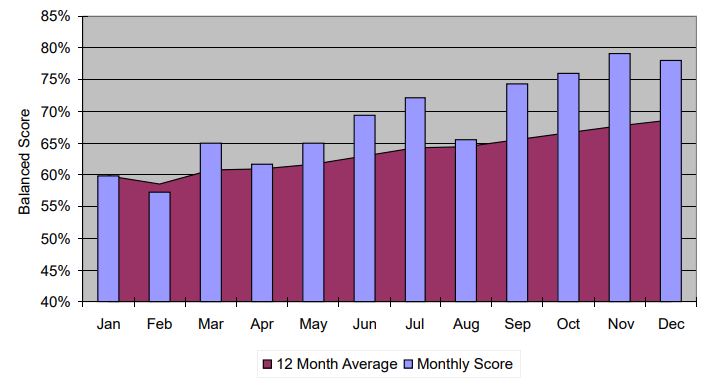
The balanced scorecard is an ideal way to track, trend, and benchmark your desktop support performance. Figure 2 below shows the trend in one company’s desktop support performance over a 12 month period. The blue bars in the chart represent the monthly balanced scores, while the red background represents the 12 month trailing trend in scorecard performance. Clearly, the performance trend for this particular desktop support group is improving!
Figure 2: Balanced Scorecard Trend
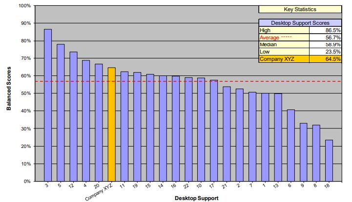
Finally, the desktop support balanced score can be used to benchmark your desktop support on a fair, apples-to-apples basis against other desktop support groups. Figure 3 below shows how the desktop support group in our example compares to 22 other desktop support groups in their benchmarking peer group.
Figure 3: Scorecard Benchmarking Comparison
Please join us for next month’s Metric of the Month: Self-Service Completion Rate, a common service desk metric that has gained increased attention in recent years.