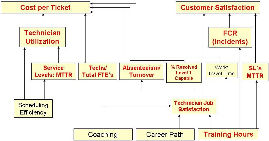
Figure 1: Desktop Support Cause-and-Effect Diagram
The Foundation Metrics
Virtually everything undertaken by desktop support can be viewed through the lens of cost and quality. Will this new technology reduce my costs? Will this new process improve customer satisfaction? This insight is crucial because it greatly simplifies decision-making for desktop support. Any undertaking that does not have the long-term effect of improving customer satisfaction, reducing costs, or both, is simply not worth doing. This is why cost per ticket and customer satisfaction are known as the foundation metrics.
These metrics are also very helpful for telling the story of desktop support performance. Most people instinctively understand cost and customer satisfaction, so it is easy to have a discussion about the performance of desktop support in the context of these two metrics. It is important to note, however, that the foundation metrics cannot be directly controlled. Instead, they are controlled through their underlying drivers.
The Underlying Drivers
Every KPI in desktop support is either directly or indirectly connected to cost per ticket and customer satisfaction. Those that directly impact the foundation metrics are called the underlying drivers, and include technician utilization, the ratio of technicians to total headcount, first contact resolution rate for incidents, technician job satisfaction, and mean time to resolve (MTTR). Improvements in any of these metrics result in corresponding improvements to the foundation metrics. But unlike the foundation metrics, which cannot be directly controlled, the underlying drivers
can be directly controlled. In fact this is where you have the greatest leverage to impact the cost and quality of desktop support.
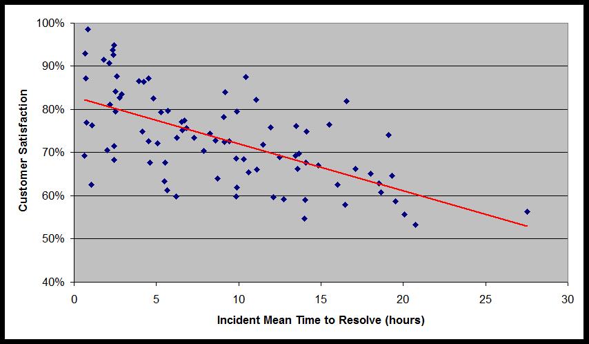
If a desktop support group is struggling with high costs, for example, reducing the cost per ticket can often be achieved by increasing technician utilization or by reducing technician absenteeism and turnover. Likewise, if the goal of desktop support is to improve customer satisfaction, this can often be achieved by improving the main service level metric, mean time to resolve. The cause-and-effect relationship between incident MTTR and customer satisfaction has been discussed in a prior Metric of the Month article, and is shown in figure 2.
Figure 2: Incident Mean Time to Resolve vs. Customer Satisfaction
The Bellwether Metrics
Technician job satisfaction and technician training hours are considered bellwether metrics because they are at the base of the KPI cause-and-effect diagram, and impact virtually every other metric in desktop support. Any movement in the bellwether metrics will be felt throughout the KPI linkage, and will eventually have an impact on the foundation metrics. If I know the technician satisfaction and training hours for a desktop support group, I can almost always predict what the cost and customer satisfaction will be.
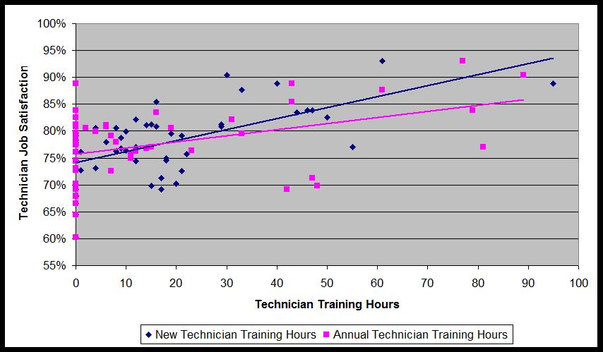
High levels of technician job satisfaction translate into lower absenteeism and turnover, which then translates into lower cost. Likewise training hours that are above average almost always have the effect of producing a higher first contact resolution rate for incidents, which then drives higher customer satisfaction levels. Moreover, training hours are also one of the key drivers of technician job satisfaction, and therefore represent a high leverage opportunity for desktop support to improve both its cost and quality performance. Figure 3 below shows the impact of training hours on technician job satisfaction.
Figure 3: Technician Training Hours vs. Technician Job Satisfaction
Once you become familiar with the cause-and-effect relationships of desktop support KPIs you will be in a much better position to identify, diagnose, and act upon any performance gaps in desktop support. This includes positive performance gaps, which you want to perpetuate, as well as negative performance gaps, which you can eliminate by modifying the underling drivers.
Please join us for next month’s
Metric of the Month:
Net Promoter Score, an increasingly common quality metric that is used in both the service desk and desktop support.
